

Visualizations
CodeLinker provides you with a rich set of tools for analyzing, exploring and visualizing your microarray or RNA-Seq data. Choose from K-Means Clustering, Jarvis-Patrick Clustering, Agglomerative Hierarchical Clustering and SOMs (Self Organizing Maps), as well as PCA (Principal Component Analysis) clustering algorithms.
To visualize your analyses, create specialized plots tuned for the algorithms you used to perform the original analysis. Each plot type can be customized, and you can export your plot in PNG, SVG or PDF formats.
CLUSTERING PLOTS
Clustering is the name given to the task of grouping items together in such a way, that those within the cluster are more similar to each other than those in other clusters. With CodeLinker you can choose from K-Means, Jarvis-Patrick, or Agglomerative Hierarchical Clustering. Once you have applied your chosen clustering algorithm you will want to use one of CodeLinker’s Clustering Plots.
You can begin your visualizations using the Color Matrix Plot. This enables you to easily visualize the values in a dataset. Other plots include the Scatter Plot which is used for the pair-wise comparison of two samples or two genes. The plot visually determines those genes that show significant induction or repression. However, if you want to focus on just a few genes or a few samples then the Coordinate Plot is great way to look at the expression profile over all your test samples or a sample’s expression over the genes of interest. With the Centroid Plot you can visualize the exemplar profile for each of the clusters arising from the algorithm you employed. The Cluster Plot is to display the profiles of individual members within a cluster. Using this plot type it is possible to drill down into the clusters and view the individual member profiles.
Tree plots visually highlight clustering relationships and CodeLinker gives you two types of tree plot. The Matrix Tree Plot is a combination of a tree plot and color matrix. The tree produced is a close reflection of the algorithm that generated it such that closely related genes tend to appear beside each other in the diagram. The Two Way Matrix Tree Plot is useful for visualizing the results of two clustering experiments simultaneously. One must be based on genes, and the other on samples and both must be derived from the same original dataset.
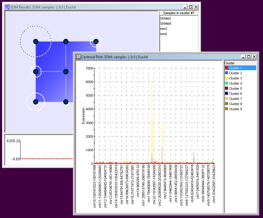
SOM (SELF ORGANIZING MAP) PLOTS
The SOM or Self Organizing Map is a clustering algorithm that is used to map a multi-dimension data set onto a two-dimensional surface such as a plot. The goal is to uncover some the underlying structure of the data by grouping similar data items together.
There are three SOM plots to choose from. The SOM Centroid Plot is used to see the profiles of the values in a datasets associated with a particular node. The SOM Cluster Plot lets you drill down into the SOM cluster to view individual member profiles. While the SOM Matrix Tree Plot uses a color matrix of values (typically gene expression levels) in conjunction with a tree plot.
PCA (PRINCIPAL COMPONENT ANALYSIS) PLOTS
PCA is a powerful technique used mostly in the exploratory analysis of data and in predictive modeling. CodeLinker lets you visualize your analyses with six different plots.
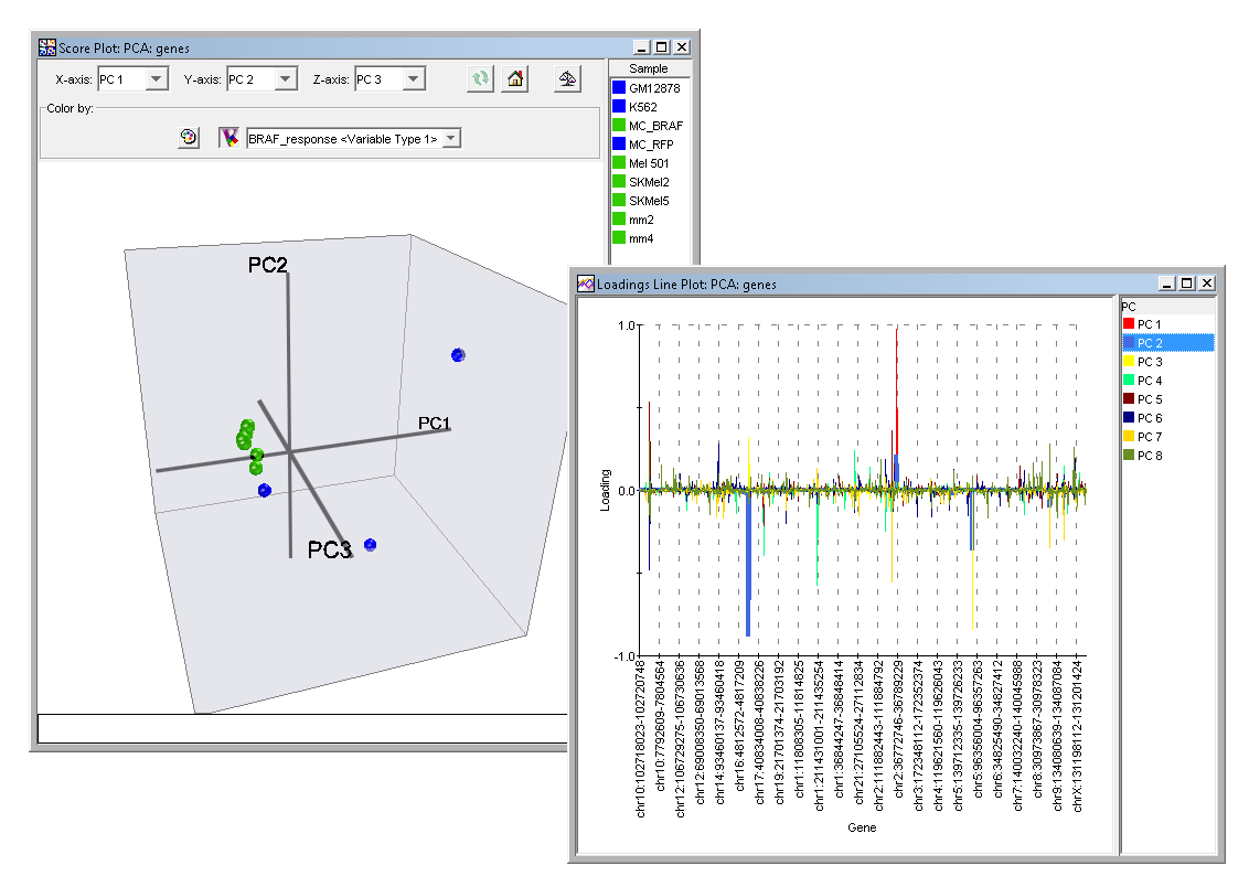
The Scree Plot is a simple line segment plot that shows the fraction of total variance in the data as explained or represented by each Principal Component. Such a plot can often show a clear separation in fraction of total variance where the most important components cease and the least important components begin. The plot is called a Scree Plot because it often looks like a scree slope, where rocks have fallen down and accumulated on the side of a mountain. The Score Plot involves projecting the data onto the Principal Components in two dimensions. Since the Principal Components were computed in a fashion which best carries the variation in the original data it is often easier to see structure in your data with this plot than it would be in the original data. The 3D Score Plot is a scatter plot where the x, y and z axes represent individual Principal Components. The points in the plot represent the original data projected onto the individual Principal Components.
Three closely related plots are the Loadings Color Matrix Plot, the Loadings Line Plot and the Loadings Scatter Plot. These display the individual elements of the Principal Components. The term Loadings refers to the extent to which the original variables (gene or sample) influence the Principal Component. The Loadings Color Matrix Plot displays these loadings as a tiled grid of colored cells. The Loadings Line Plot displays the loadings as a connected line graph. While the Loadings Scatter Plot displays the loadings in a scatter plot of one selected Principal Component versus another selected Principal Component.
To visualize your analyses, there are specialized plots tuned for the algorithms you used to perform the original analysis. Each plot type can be customised and you can export your plot in PNG, SVG, or PDF formats.